Back to Projects

Designing a bi-directional app for multi-linguals

,

We try to optimize accessibility in designing products that use languages based on RTL as well as LTR languages.

Flouci

Year

2019

Team

UX Writer, Researcher, 3 Devs

Context
Role
Problem
Research
Challenges
Solution
Impact
Learnings
Top

Background & context

A mobile app in different languages

Flouci is the first wallet that is designed to innovate mobile payment in Tunisia. It serves as a quick, easy, and convenient way to open a bank account, send and receive money, and pay different merchants in-person or online, all from within the app.

Our first product speaks to the Tunisian consumer and hence needs to be accessible by everyone given the company's highly upheld value of financial inclusion.

My role

Scalable design for two directions

My role is summarized in exploring a variety of standards that can be applied to RTL (i.e. for Arabic) design standards that are expounded by brands like Google and Airbnb in their endeavors to increase accessibility to users around worldwide.

My deliverables were the following:

  • Design tradeoffs in mirroring layouts
  • Testing established standards on Tunisian users
  • Build rationale around applying design patterns from previous and tweaked standards

Problem Statement

Designing for monolingual and bilingual (even trilingual) users

How to optimize accessibility in designing products that use languages based on RTL as well as LTR languages?

Research and Insights

Understanding the what and the why of the language in experiences

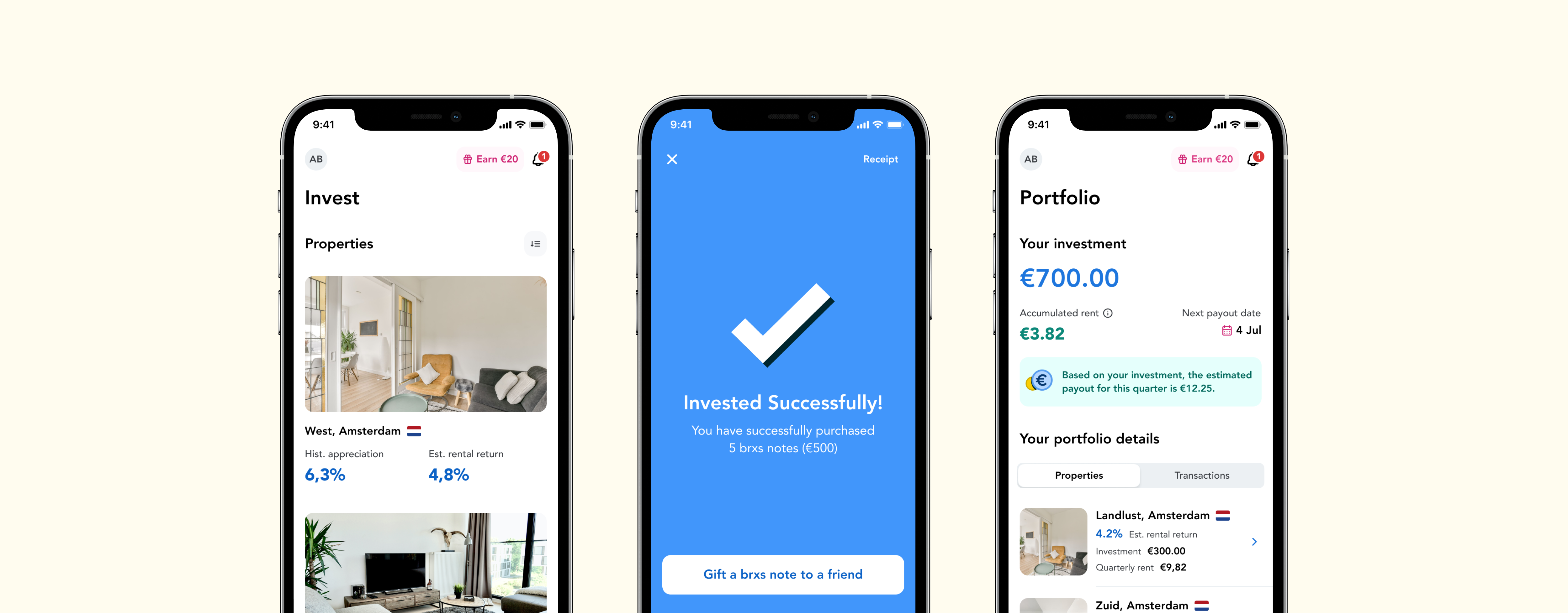
We started our study with a literature review and background research about different systems that implement language and layout patterns for bi-directional languages.

User personas

Our user personas ranged to 5 different proto-personas that have different pain points, goals, and behavioral tendencies. Below is the list of personas we concluded:

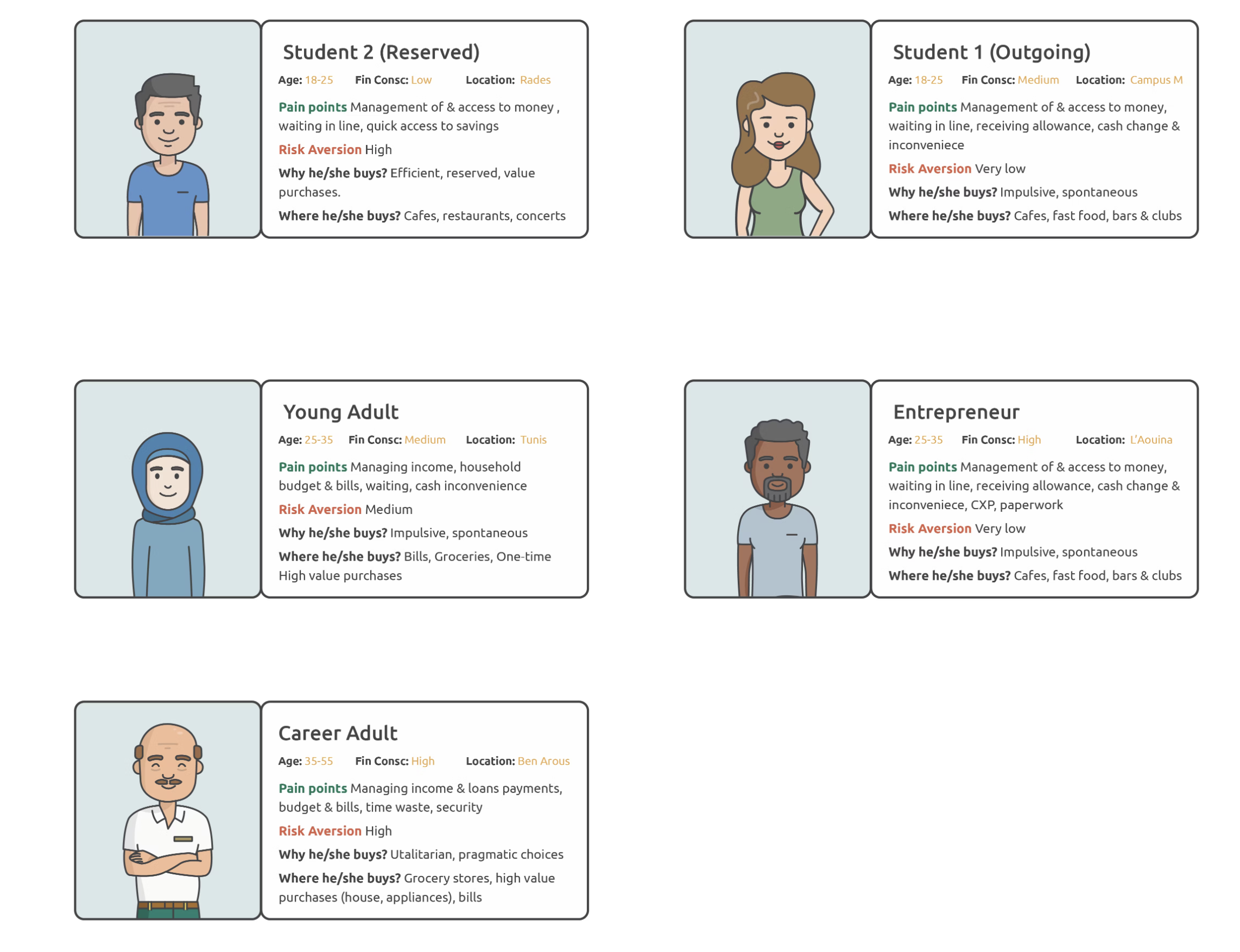
These personas expound the variety of consumer needs that Flouci can fulfill and the requirement for the app to be accessible and designed with the aforementioned personas in mind.

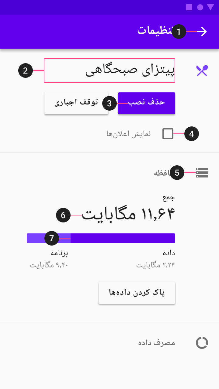
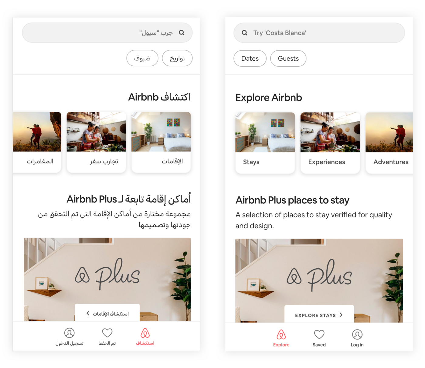
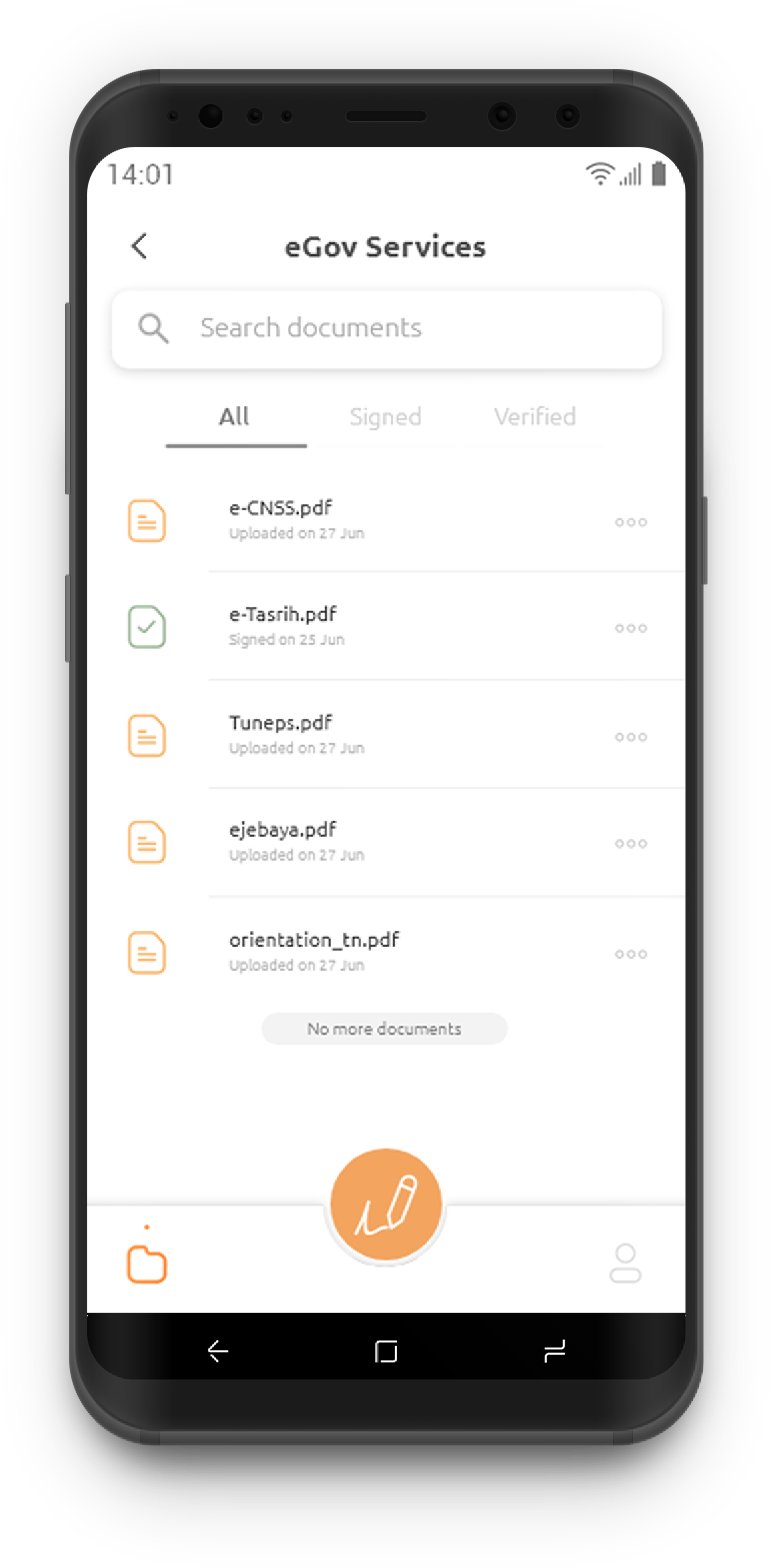
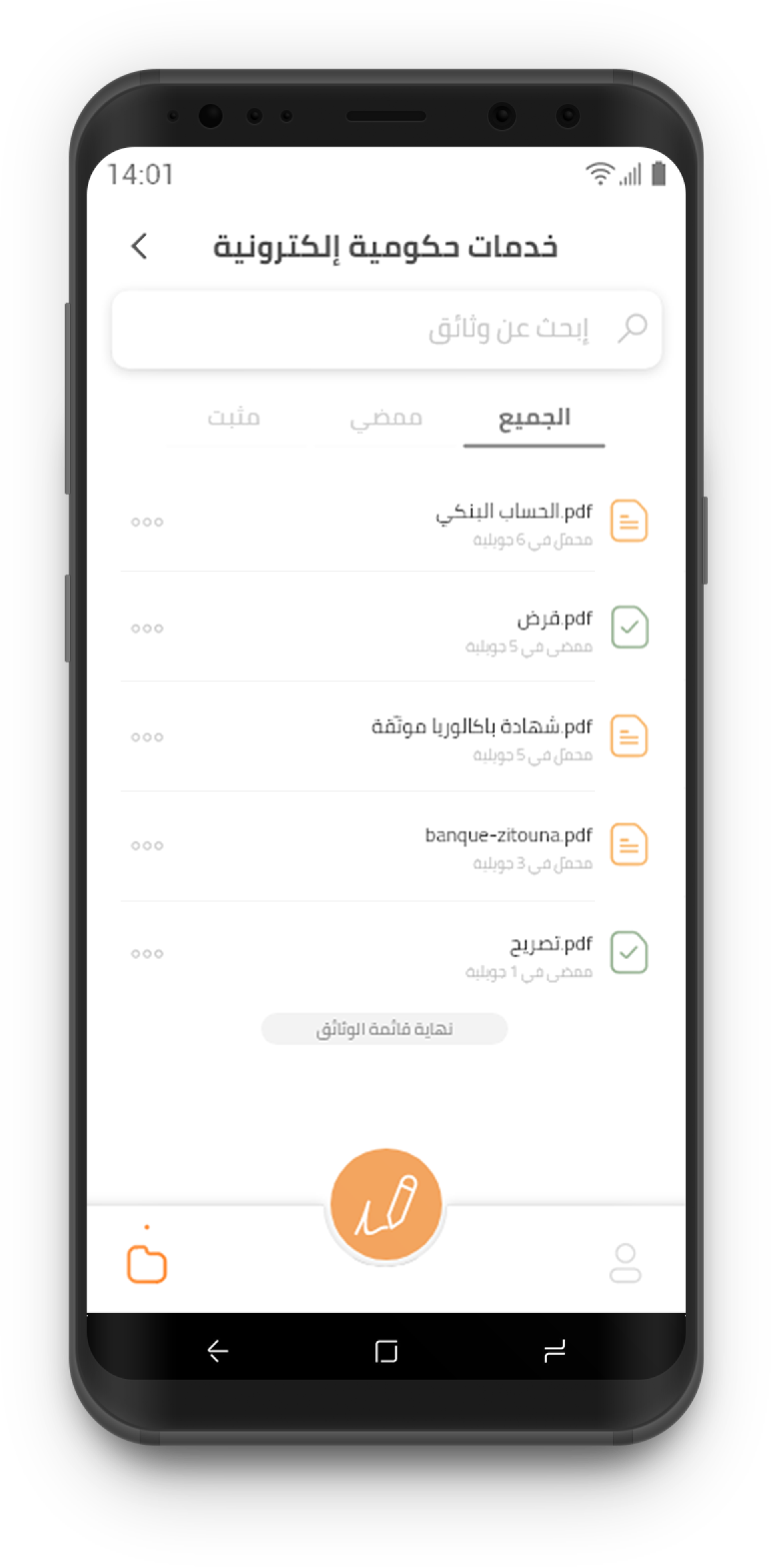
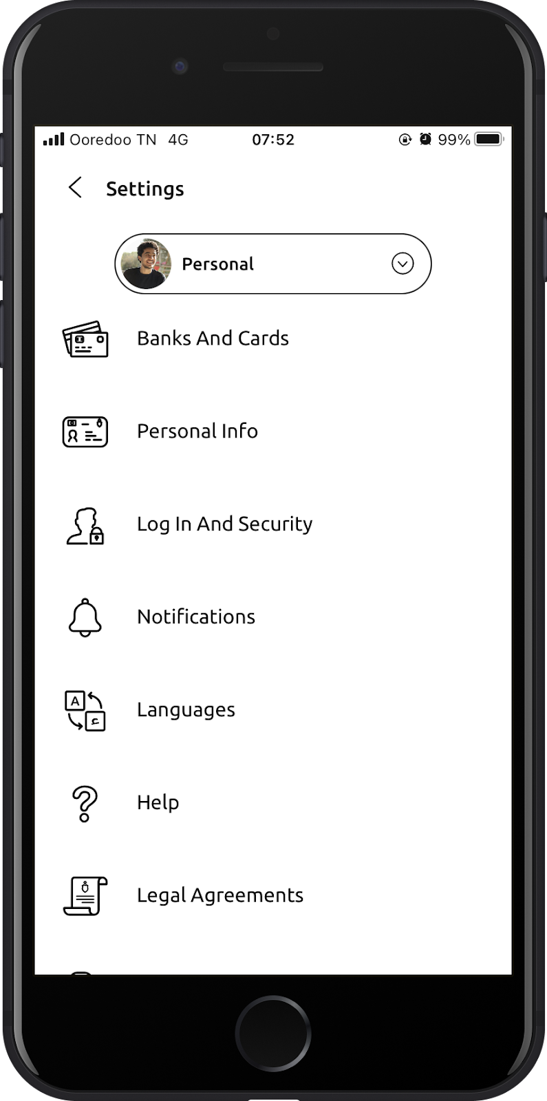
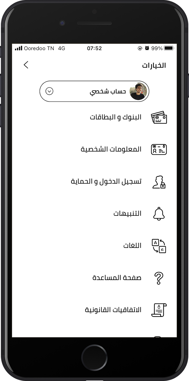
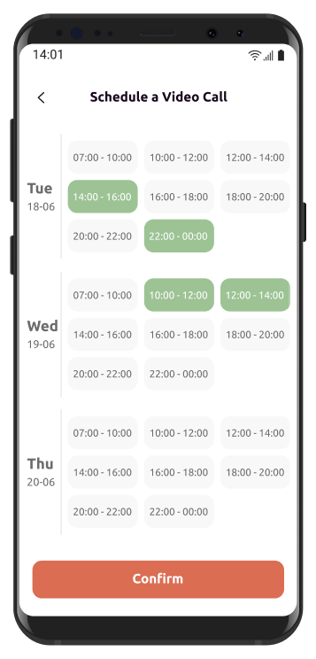
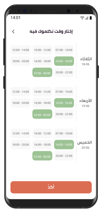
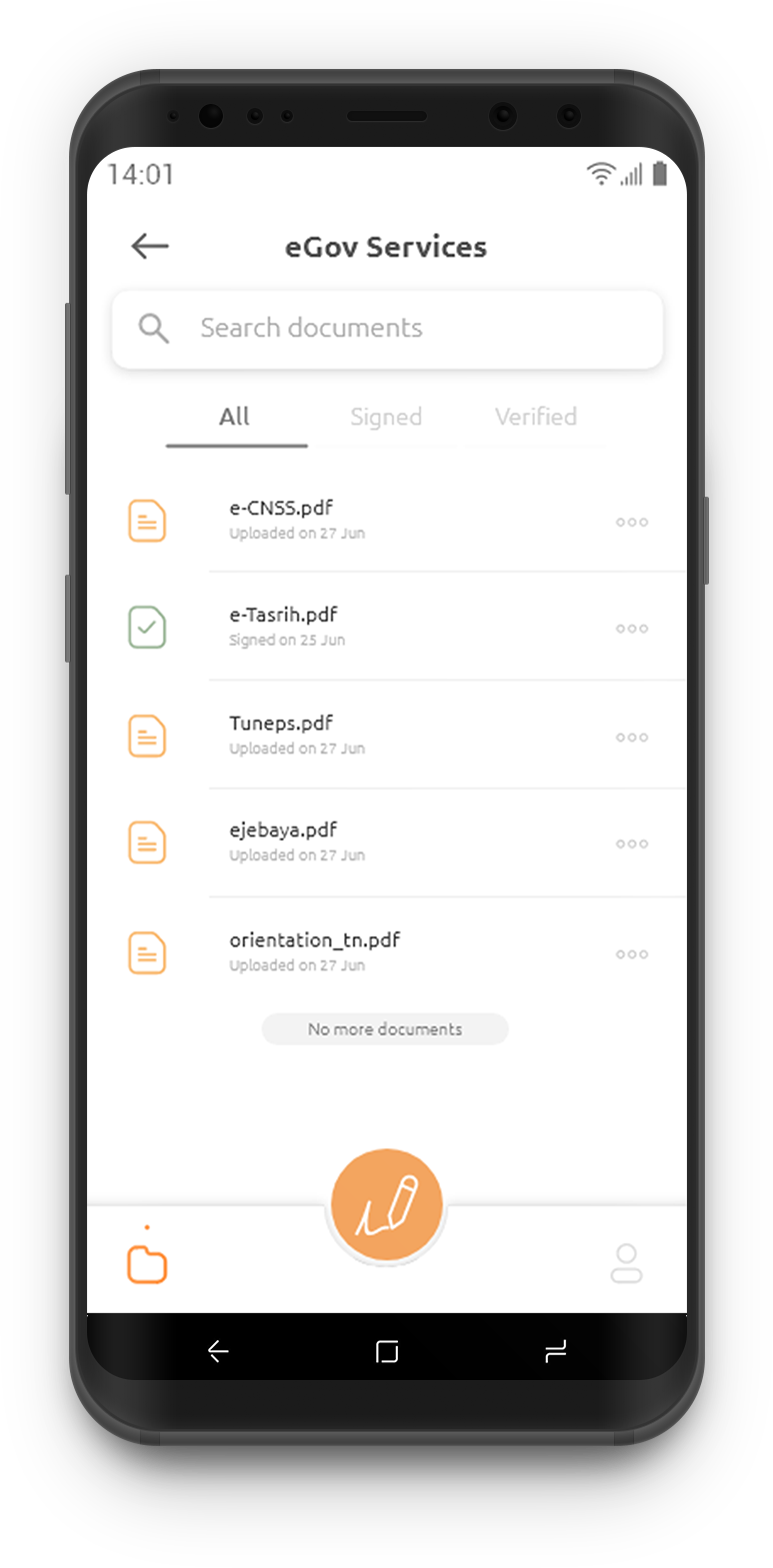
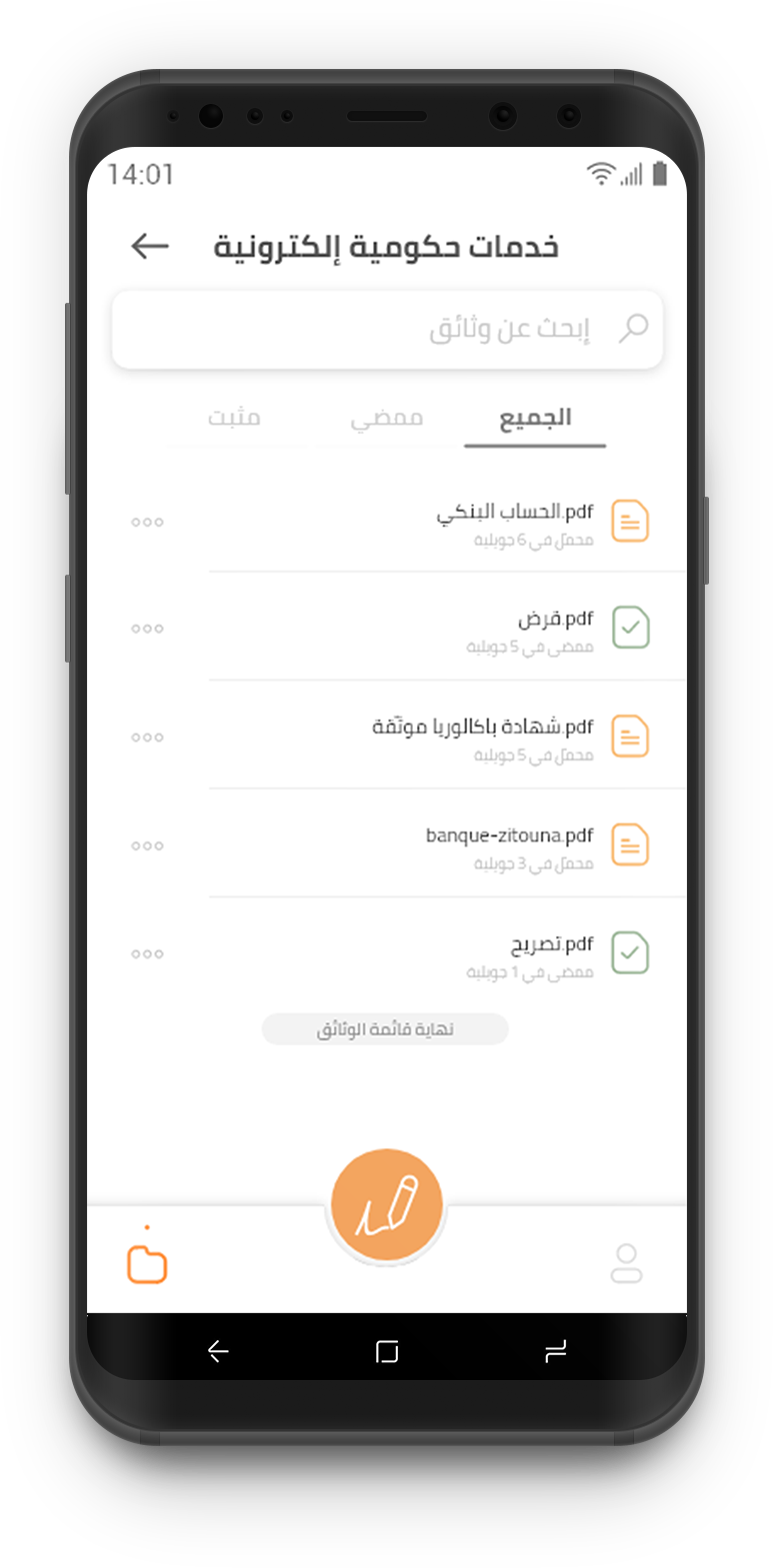
From user research, we found out that Tunisian users opt to skim and view any information from left to right, but read Arabic right to left.
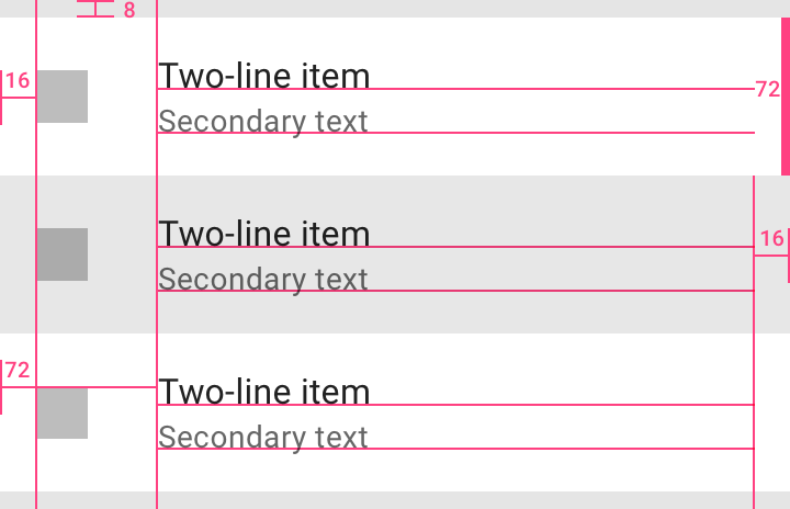
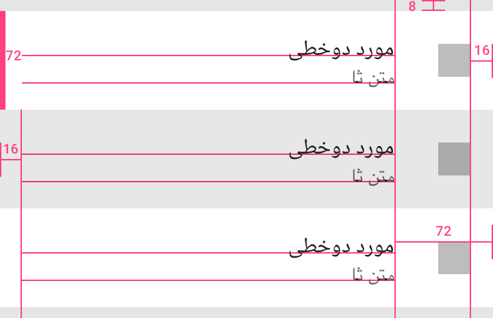
Material Design

Google's material design has a set of rules that apply to Bi-directionality and try to solve the tradeoff problems between mirroring layouts, changing the information architecture, or refining the assets to fit within a certain design style and emphasize the ease of use and scalability of digital products. A good example is Material Design's comparison with ListItem components.

Added to that, Google's standards for primary secondary actions transcend language and follow the RTL inverted F-shaped design pattern.

Airbnb Design

Airbnb's approach is a lot more fail-and-update. Their design pattern has evolved in their app interface. The design decisions that yielded a left-direction side scroll were quite interesting as I was curious if that is the case with side scroll behaviors across all elements (e.g. List Items actions: edit, archive, delete).

Airbnb's approach to bi-directionality and the swipe and drag gestures

Challenges & tradeoffs

Designing RTL while refining heuristics

Challenges

⚙️ Habits formed from previous apps (e.g. Facebook) vs. learning standard RTL user interactions
⚙️ Formulating informed design choices based on readability, user opinions, and time on tasks, rather than potentially better, behavioral metrics such as lostness rate.

Corrections

💎 Including two languages in screens that are crucial to the process (e.g. Steps of the KYC process). (no tradeoff between languages or RTL vs. LTR )
💎 Mirror list items and views based on similar granularities. (e.g. Settings list)
💎 We did not mirror the screen routing like Material Design's setting page given Apple's iOS standard gesture of swiping (left to right) as a main action to go back. This started on iPhones, however, other devices, including Google Pixel, are following along (e.g. Android 10).

Solution

Visual systems that embrace bi-direction as an attribute

The product and research teams have tackled the different challenges that come with the multi-language support. We took on the following topics:

Electronic Signature screen: Arabic vs. Latin

eGov services screen (now named eSignature) will be used by adults who are limited to one language (that is usually Arabic). This dictated that we adhere to the RTL patterns and standards in creating the list item component.

Settings list (Icons, components)

For our settings list we elected to keep our icons given their non-directionality (i.e. no arrows or LTR symbols).

We opted for mirroring the list for the Arabic version and utilize our design system's consistent font styles (Ubuntu & Cairo) so the mirroring of list labels have the same visual patterns as opposed to Material Design's use of Display curve-based font for Arabic which does not necessarily fit with Roboto (Material Design's go-to font for latin).

Spacing (margins, padding) in custom components

Our bank account creation process dictates that the user has a video call (given the Tunisian standards for KYC). When creating the video call appointment screen, we needed to consider accessibility and understandability as a pillar for putting together the design. As a result, some tradeoffs came up as we tried to mirror layout elements (e.g. dates, spacing). For instance, we elected to go with a full name for the day as it is harder to understand in Arabic.

Hybrid-information components

For this screen our researchers and UX writer wanted to discuss the possibility of putting two languages in each "Step card" in order to lower chances of misunderstanding. In the case they pick English (see photo below), there is an alternative Arabic version on each card.

Impact

Approachable products win by design

We found the impact on usability and design in the reviews we received for the app. It was our brand manager's feedback with a comment of one of our users who attested to how refreshing an application in Arabic and alternatively Tunisian dialect is inclusive in a company that is striving for financial inclusion for the 64% unbanked population in Tunisia.

Application store reviews analysis

Learnings

Building an understanding of lostness and feature success

  • Layout shortcuts for quick design decisions: Our team learned from this exercise that the only way to beat the weakness of assumptions is by constantly challenging them and building sound rationale behind design decisions.
  • Accessibility through language: As the designer on the team, I learned how to work with our UX writer and engineers in tandem and utilize information architecture and spacing calculation to fit text that can communicate best to our users.

References

Summary

We try to optimize accessibility in designing products that use languages based on RTL as well as LTR languages.

Background & context

Flouci is the first wallet that is designed to innovate mobile payment in Tunisia. It serves as a quick, easy, and convenient way to open a bank account, send and receive money, and pay different merchants in-person or online, all from within the app. Our first product speaks to the Tunisian consumer and hence needs to be accessible by everyone given the company's highly upheld value of financial inclusion.

Deliverables

  • Design tradeoffs in mirroring layouts
  • Testing established standards on Tunisian users
  • Build rationale around applying design patterns from previous and tweaked standards
My role is summarized in exploring a variety of standards that can be applied to RTL (i.e. for Arabic) design standards that are expounded by brands like Google and Airbnb in their endeavors to increase accessibility to users around worldwide.

Problem Statement

How to optimize accessibility in designing products that use languages based on RTL as well as LTR languages?

Research and Insights

We started by dissecting the conversion problem, then the activity problem. We wanted to know why users are not completing their frequent tasks. We had a few assumptions about find-ability of features within the app.

Material Design:

Google's material design has a set of rules that apply to Bi-directionality and try to solve the tradeoff problems between mirroring layouts, changing the information architecture, or refining the assets to fit within a certain design style and emphasize the ease of use and scalability of digital products. A good example is Material Design's comparison with ListItem components.

Their spacing and mirroring of the different elements is educated and thoroughly investigated.

Added to that, Google's standards for primary secondary actions transcend language and follow the RTL inverted F-shaped design pattern.

Airbnb Design:

Airbnb's approach is a lot more fail-and-update. Their design pattern has evolved in their app interface. The design decisions that yielded a left-direction side scroll were quite interesting as I was curious if that is the case with side scroll behaviors across all elements (e.g. List Items actions: edit, archive, delete).

Challenges and tradeoffs

Cases

Workaround

Habits formed from previous apps (e.g. Facebook) vs. learning standard RTL user interactions
Including two languages in screens that are crucial to the process (e.g. Steps of the KYC process). (no tradeoff between languages or RTL vs. LTR )
Formulating informed design choices based on readability, user opinions, and time on tasks, rather than potentially better, behavioral metrics such as lostness rate.
Mirror list items and views based on similar granularities. (e.g. Settings list)
We did not mirror the screen routing like Material Design's setting page given Apple's iOS standard gesture of swiping (left to right) as a main action to go back. This started on iPhones, however, other devices, including Google Pixel, are following along (e.g. Android 10).

Exploration & design decisions

The product and research teams have tackled the different challenges that come with the multi-language support. We took on the following topics:

Electronic Signature screen: Arabic vs. Latin

eGov services screen (now named eSignature) will be used by adults who are limited to one language (that is usually Arabic). This dictated that we adhere to the RTL patterns and standards in creating the list item component.

Settings list (Icons, components)

For our settings list we elected to keep our icons given their non-directionality (i.e. no arrows or LTR symbols).

We opted for mirroring the list for the Arabic version and utilize our design system's consistent font styles (Ubuntu & Cairo) so the mirroring of list labels have the same visual patterns as opposed to Material Design's use of Display curve-based font for Arabic which does not necessarily fit with Roboto (Material Design's go-to font for latin).

Spacing (margins, padding) in custom components

Our bank account creation process dictates that the user has a video call (given the Tunisian standards for KYC). When creating the video call appointment screen, we needed to consider accessibility and understandability as a pillar for putting together the design. As a result, some tradeoffs came up as we tried to mirror layout elements (e.g. dates, spacing). For instance, we elected to go with a full name for the day as it is harder to understand in Arabic.

Hybrid-information components

For this screen our researchers and UX writer wanted to discuss the possibility of putting two languages in each "Step card" in order to lower chances of misunderstanding. In the case they pick English (see photo below), there is an alternative Arabic version on each card.

Learning points & improvements

  • Layout shortcuts for quick design decisions: Our team learned from this exercise that the only way to beat the weakness of assumptions is by constantly challenging them and building sound rationale behind design decisions.
  • Accessibility through language: As the designer on the team, I learned how to work with our UX writer and engineers in tandem and utilize information architecture and spacing calculation to fit text that can communicate best to our users.

More projects

bunq's Universal App Search
We created a cross-app search to make the bunq experience seamless in finding features, settings, and actions.
bunq
Designing real estate investing for everyone
I led the design & creative effort to launch a real estate investing platform and get €1M in investments in less than 1 year.
BRXS