Back to Projects

Getting started with global banking

,

I led the design of the signup/onboarding experience for bunq to improve the conversion rate between several key steps.

bunq

Year

2021

Team

2 POs, 2 UXRs, Writer, 2 Mobile Devs

Context
Role
Process
Problem
Research
Exploration
Testing
Challenges
Solution
Impact
Learnings
Top

Background & context

New way of banking globally

Onboarding users to a bank is never a straightforward experience, be it physical or online.

At bunq, having always tried to "make life easy", this may have been another tradeoff that requires rethinking the signup experience through a specific customer persona.

My role

Make a bank a habit-forming instrument

My role was being the product designer in the project, led by our Head of Data, Research, & Analytics and in collaboration with two software engineers and one product owner and two researchers.

Deliverables

  • Gap Analysis on the current account creation experience
  • A more engaging first interaction on app's first open
  • Prototype of an onboarding flow increasing conversion by +10%

Design Toolkit

Process

Design Process

With a specific-outcome driven project, this was my process:

Problem Statement

How do we make the initial start of a banking experience exciting and sticky?

After focusing on making the signup easy, user conversion is dropping drastically over 3 months compared to the previous 3 months (even though task success rate improved considerably).

What is app stickiness?
A sticky app holds a loyal audience, low churn, and high engagement when it delivers a great and unique user experience that sets it apart from the competition. Stickiness is all about users finding your app valuable and relevant to their lives.

Research and Insights

Understanding first-time users

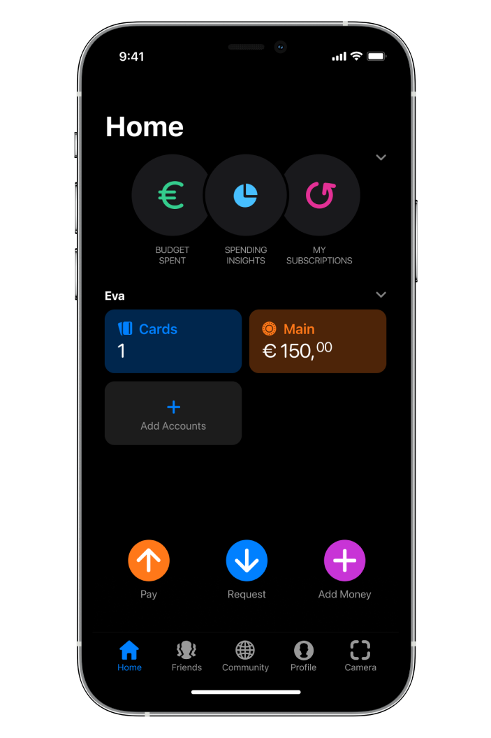
User persona: Eva

Across the whole company, we developed a user persona with a set of demographics, behaviors, and pain points (the details are confidential).

These users express a need for the bunq app and feel empowered in dealing with their finances through it.

After asking 10 Evas why would they drop-off during signup; 7 out of 10 mentioned that do not see clear features when choosing a plan:

Average time from current step for first app open to completing signup is significantly higher month on month, and easy setup duration increased considerably over the past 15 months.

  • “What is Easy Green? Um I'm not sure”
  • “It didn't seem like it was showing features or prices”
  • “I don’t understand what “open a bank account and 5 minutes” means and has to do here”
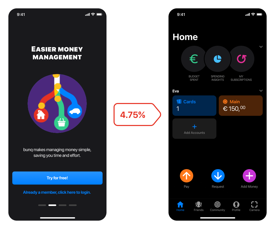
Conversion between App first openFirst invoice paid

Exploration and design concept

Tackling the weakest links

We are conducted the following multivariate tests:

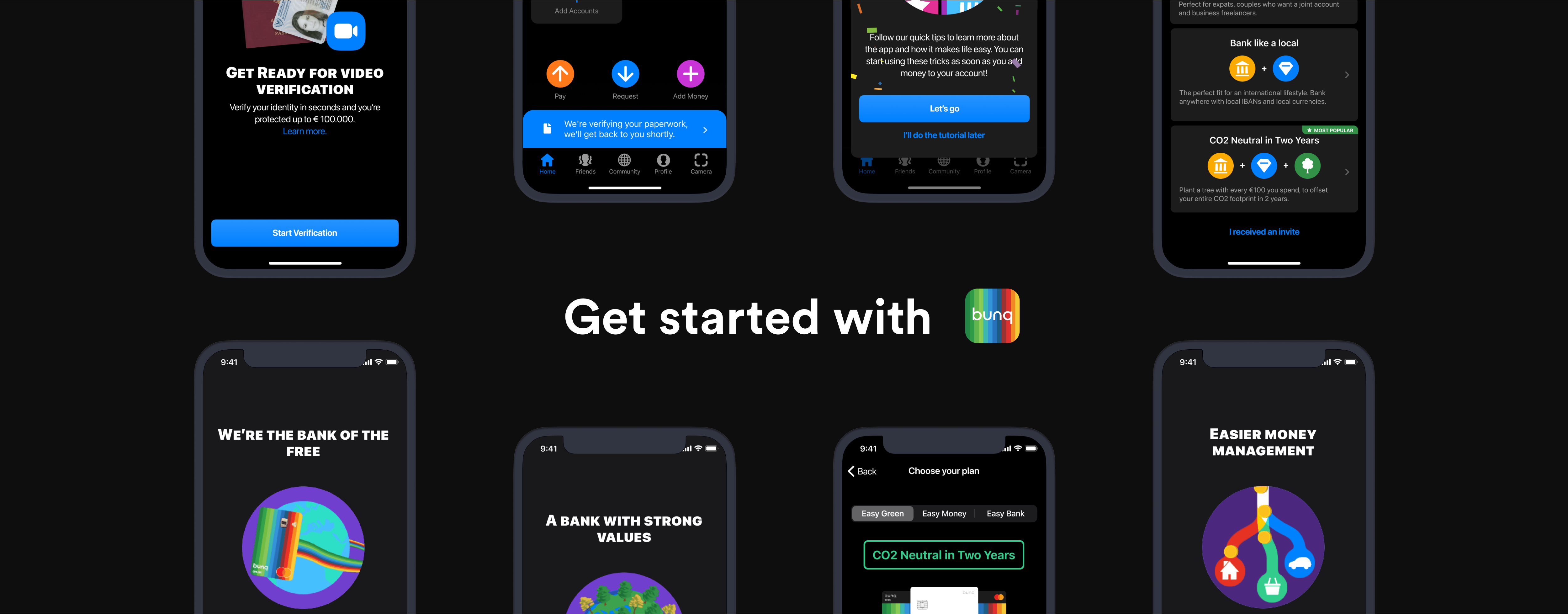
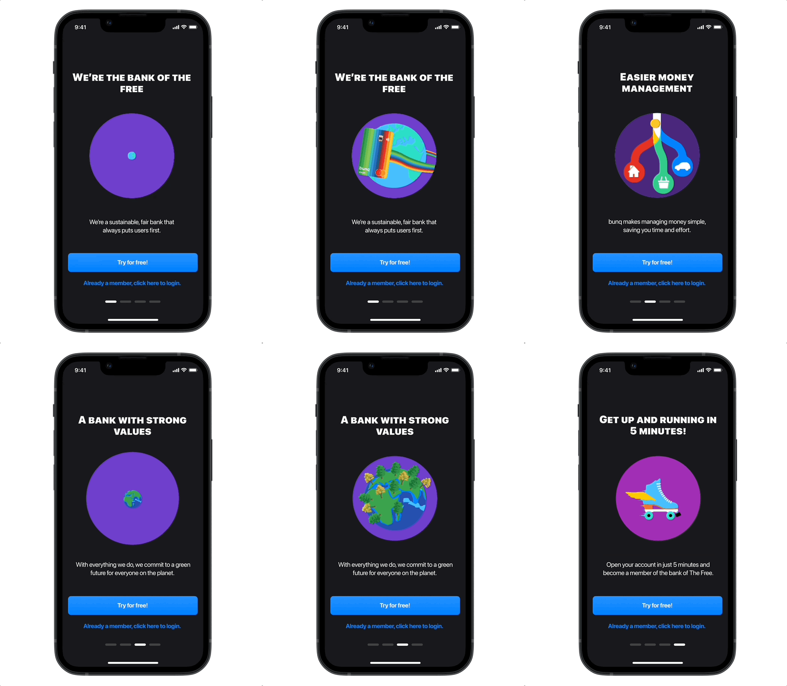
First 5 seconds

  1. A basic signup screen (Control experience)
  2. A static carousel
  3. An animated, auto-sliding carousels

Selecting a Plan

  1. Trial first, decide after trial end (Control Experience)
  2. With a purpose
  3. With a comprehensive, fully detailed comparison

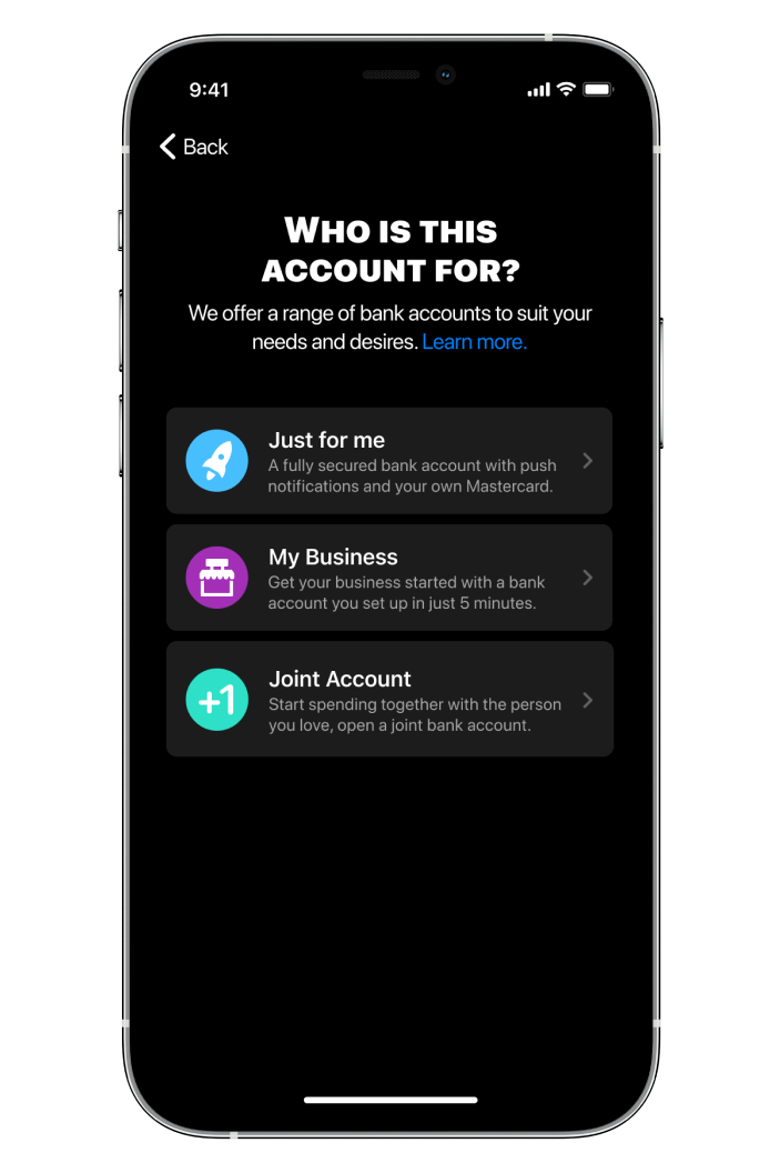
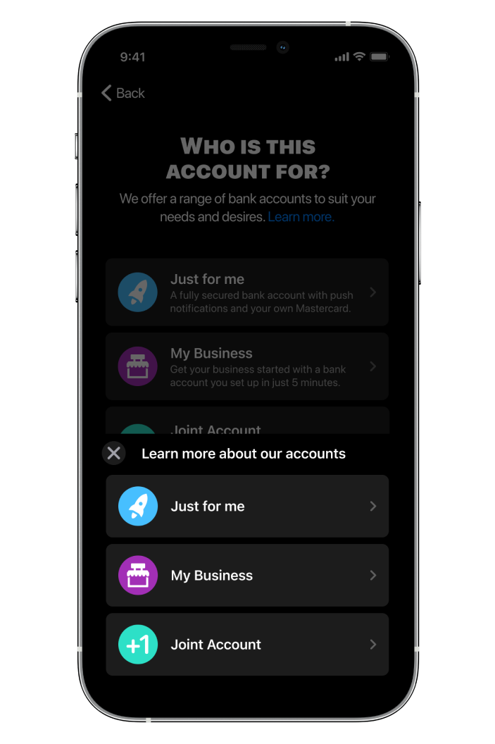
Selecting a type of account (Personal, Business, Joint)

  1. Skip it, users can add accounts later (Control Experience)
  2. Objective explanations (One interaction to choose, one to confirm)
  3. Subjective explanation (One interaction to directly choose)
Why did we choose these interactions? These interactions were related to the lowest conversion rates (weakest links) in the signup flows.

Testing & Feedback

Understanding user confidence during onboarding journeys

To make the design decisions, the results pointed to altering the following interactions/screens:

We chose our hypotheses based on a combination of qualitative testing (in-depth interviews), usability testing, and heuristics.

Results

Let's take the example of the plan choice flow: We ran usability testing for different variations of the signup process. We noticed that the user is dropping off during the onboarding process due to overwhelm and confusion.

We have run an A/B/C test with the current variants:

Variant A was the most converting (with 95% confidence), however gave the lesser amount of details. Variant B, though information-heavy, lead to users to feel less confident because the need to read more about the plans before choosing.

There are discrepancies in what users say and what they do, especially when choosing a plan, they like comparing, but the process is not necessarily clear or simple.

What users said

vs. What they did

💬 “Detailed plans with features & pricing is good”
📱 Finished the process with the simpler plans much faster (2x or more)
💬 “How do I choose the adequate account type”
📱 Skipped the account choice for the control experience

Challenges and tradeoffs

Corner cases and refinements throughout the onboarding design

We have run an A/B/C test with the current variants:

Cases

Workaround

Corner cases and exit points for signup while keeping users in relevant journey
Setting guidelines for the signup experience; how to handle wrong entries, inadequate account type and category picks, and long wait time for live ID verification
Compliance with the different business banking laws and keeping the process under 5 minutes to fulfill selling proposition
Launched on 06-10-2021, the new signup has resulted in higher conversion overall

Solution

Bridging links from first open to the first invoice

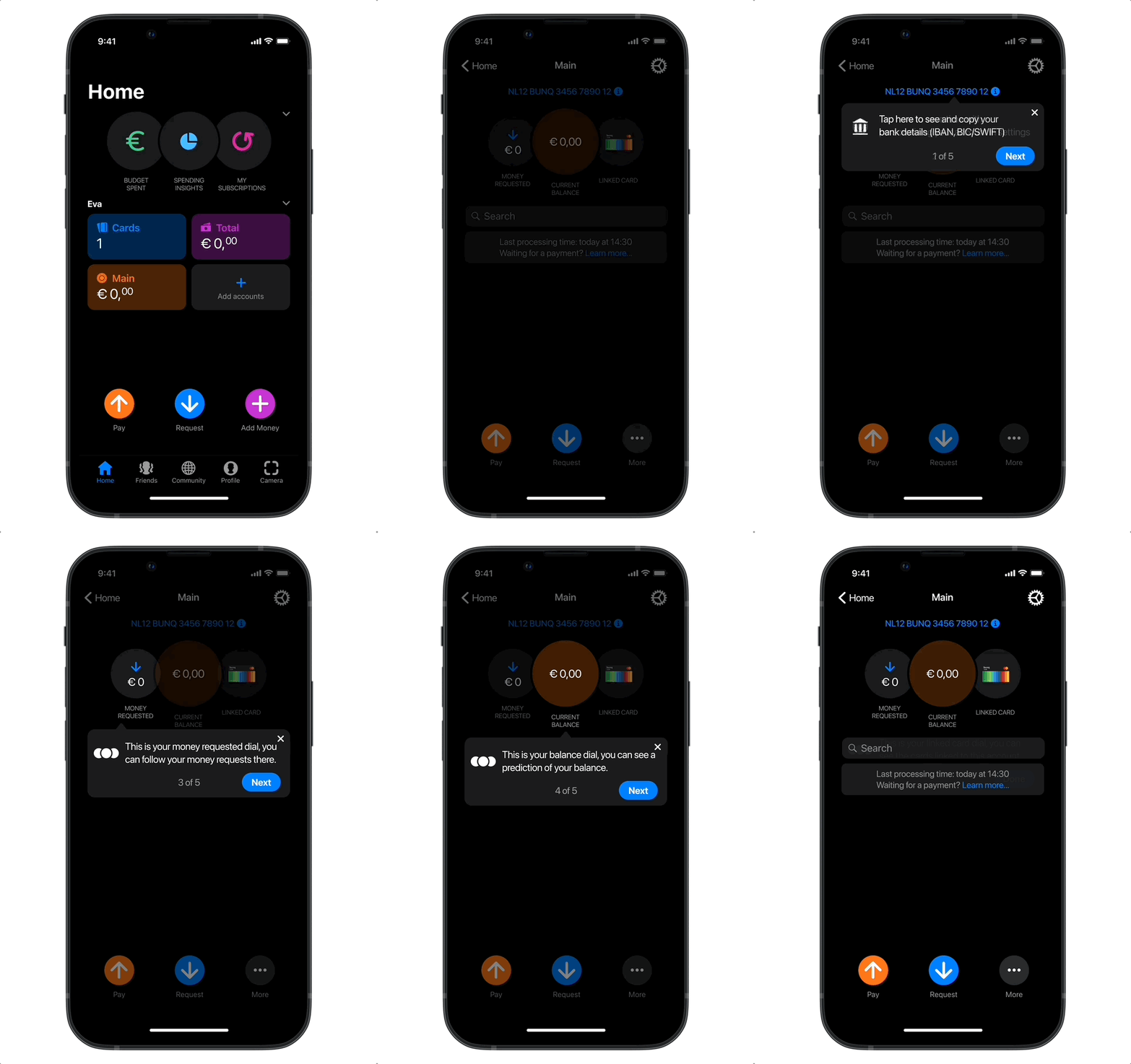
We filled the gaps in the user onboarding by pushing the following updates:

5 seconds or less to decide to give bunq a free trial

The first impression of the app should be a convincing pitch, focusing on the value proposition, but at the same time, enticing enough to start exploring.

Users have to understand what plan they choose

Users are given a purpose-based "deal" consideration where they choose what value they suits their needs.

Users are empowered to learn about all types of accounts

We walk users through what type of account they can get with bunq, by including a comparison experience.

User re-verify conversion increase

We increased re-verification conversion from 29% to 44% by simply preparing users for the video verification phase, as well as providing a consideration (help, verification explanation) for possible frustrations with repeated experiences.

User activation (i.e. from verified to 1st invoice)

Giving tutorials to the prompt actions highly correlated with retention, increased long-term conversion of our paying customers.

Impact

Outcomes

↓ 18.6% Lower Time on Task

Following a rule of lowest possible number of interactions per screen.

↑12.1% Increase in Card orders

This metric is the activity driver of the app, hence resulting in more retention.

↑36.67% Signup conversion

By reducing journey errors, we increased the mean time to failure. This resulted in less churn rates.

Learnings

Building an understanding of lostness and feature success

  • Learned how to navigate offering choices & journey options while keeping clarity and purposeful design
  • Found common ground between asking for all the necessary information (compliance) while providing a seamless, linear user flow for users to sign up in 5 minutes
  • Still trying to find the right balance between giving all the necessary information and cognitive overload in an initiation flow (i.e. signup/onboarding)
Summary

I led the design of the signup/onboarding experience for bunq to improve the conversion rate between several key steps.

Background & context

Onboarding users to a bank is never a straightforward experience, be it physical or online. At bunq, having always tried to "make life easy", this may have been another tradeoff that requires rethinking the signup experience through a specific customer persona.

Deliverables

  • Gap Analysis on the current account creation experience
  • A more engaging first interaction on app's first open
  • Prototype of an onboarding flow increasing conversion by +10%
My role was being the product designer in the project, led by our Head of Data, Research, & Analytics and in collaboration with two software engineers and one product owner and two researchers.

Problem Statement

After focusing on making the signup easy, user conversion is dropping drastically over 3 months compared to the previous 3 months (even though task success rate improved considerably).

Research and Insights

Average time from current step for first app open to completing signup is significantly higher month on month, and easy setup duration increased considerably over the past 15 months.

After asking 10 users why would they drop-off during signup; 7 out of 10 mentioned that do not seeclear features when choosing a plan:

  • “What is Easy Green? Um I'm not sure”
  • “it didn't seem like it was showing features or prices”
  • “I don’t understand what “open a bank account and 5 minutes” means and has to do here”

Conversion between App first openFirst invoice paid

Exploration and design concept

We are conducted the following multivariate tests:

First 5 seconds

  1. A basic signup screen (Control experience)
  2. A static carousel
  3. An animated, auto-sliding carousels

Selecting a Plan

  1. Trial first, decide after trial end (Control Experience)
  2. With a purpose
  3. With a comprehensive, fully detailed comparison

Selecting a type of account (Personal, Business, Joint)

  1. Skip it, users can add accounts later (Control Experience)
  2. Objective explanations (One interaction to choose, one to confirm)
  3. Subjective explanation (One interaction to directly choose)
Why did we choose these interactions? These interactions were related to the lowest conversion rates (weakest links) in the signup flows.

Testing and feedback

To make the design decisions, the results pointed to altering the following interactions/screens:
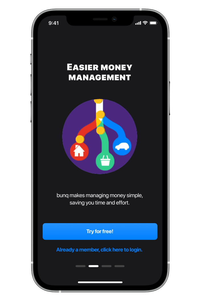
We chose our hypotheses based on a combination of qualitative testing (in-depth interviews), usability testing, and heuristics.

Results

Let's take the example of the plan choice flow: We ran usability testing for different variations of the signup process. We noticed that the user is dropping off during the onboarding process due to overwhelm and confusion.

We have run an A/B/C test with the current variants:
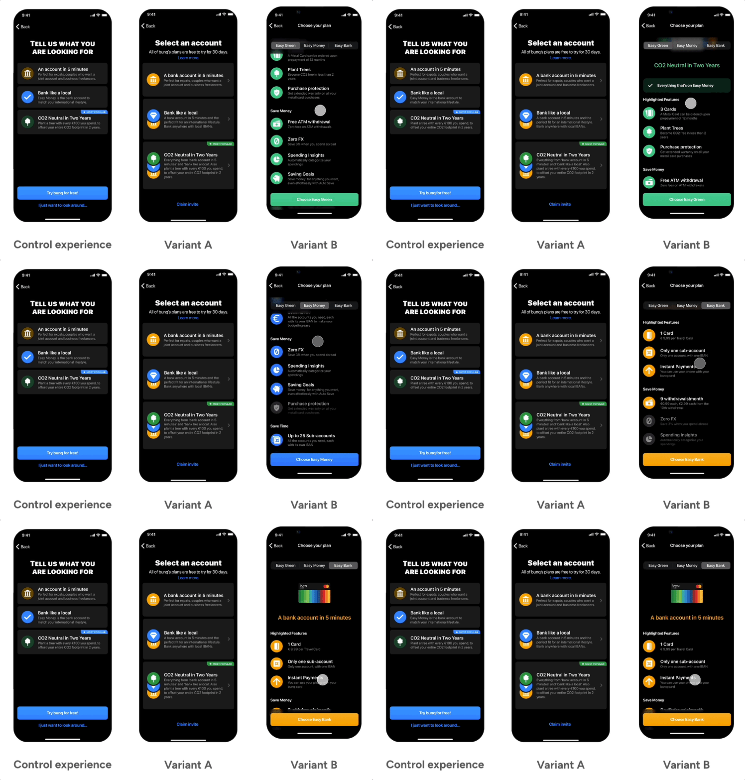
Variant A was the most converting (with 95% confidence), however gave the lesser amount of details. Variant B, though information-heavy, lead to users to feel less confident because the need to read more about the plans before choosing.

There are discrepancies in what users say and what they do, especially when choosing a plan, they like comparing, but the process is not necessarily clear or simple.

What users said

What users did

💬 “Detailed plans with features & pricing is good”
📱 Finished the process with the simpler plans much faster (2x or more)
💬 “Detailed plans with features & pricing is good”
📱 Finished the process with the simpler plans much faster (2x or more)

Challenges and tradeoffs

Cases

Workaround

Corner cases and exit points for signup while keeping users in relevant journey
Setting guidelines for the signup experience; how to handle wrong entries, inadequate account type and category picks, and long wait time for live ID verification
Compliance with the different business banking laws and keeping the process under 5 minutes to fulfill selling proposition
Launched on 06-10-2021, the new signup has resulted in higher conversion overall

Solution

We filled the gaps in the user onboarding by pushing the following updates:

5 seconds or less to decide to give bunq a free trial

The first impression of the app should be a convincing pitch, focusing on the value proposition, but at the same time, enticing enough to start exploring.
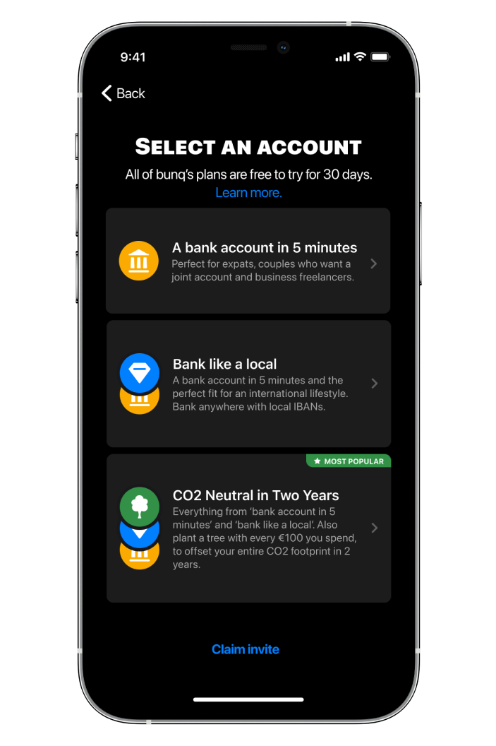
Users have to understand what plan they choose

Users are given a purpose-based "deal" consideration where they choose what value they suits their needs.

Users are empowered to learn about all types of accounts

We walk users through what type of account they can get with bunq, by including a comparison experience.
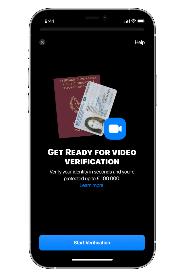
User re-verify conversion increase

We increased re-verification conversion from 29% to 44% by simply preparing users for the video verification phase, as well as providing a consideration (help, verification explanation) for possible frustrations with repeated experiences.

User activation (i.e. from verified to 1st invoice)

Giving tutorials to the prompt actions highly correlated with retention, increased long-term conversion of our paying customers.
Outcomes

↓ 18.6% Lower Time on Task

Following a rule of lowest possible number of interactions per screen.

↑12.1% Increase in Card orders

This metric is the activity driver of the app, hence resulting in more retention.

↑36.67% Signup conversion

By reducing journey errors, we increased the mean time to failure. This resulted in less churn rates.

Learning points

  • Learned how to navigate offering choices & journey options while keeping clarity and purposeful design
  • Found common ground between asking for all the necessary information (compliance) while providing a seamless, linear user flow for users to sign up in 5 minutes
  • Still trying to find the right balance between giving all the necessary information and cognitive overload in an initiation flow (i.e. signup/onboarding)

More projects

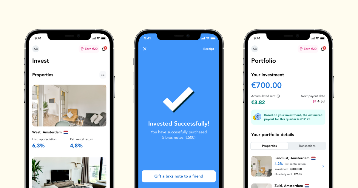
Designing real estate investing for everyone
I led the design & creative effort to launch a real estate investing platform and get €1M in investments in less than 1 year.
BRXS
bunq's Universal App Search
We created a cross-app search to make the bunq experience seamless in finding features, settings, and actions.
bunq