Back to Projects

Designing real estate investing for everyone

,

I designed a real estate investing platform and generated €1M in investments in the first year of launch.

BRXS

Year

2022

Team

PM, Mobile Dev,  Backend Dev

Context
Role
Process
Problem
Research
Exploration
Testing
Solution
Impact
Highlights
Learnings
Top

Background & context

Investing like the 1%

Investing has been disrupted by products designed to make it accessible for people to trade/invest in assets and put their money to use.

Investing in real estate is usually reserved for the few with a large enough sum of money to buy a second or third house and put that money to work, earning rent and benefiting from the change in their property value. So BRXS launched a platform where people could invest in houses via BRXS-notes, starting from €100.

Fractionalizing this asset class to the 99% is a true challenge, not only from the “offering” standpoint but also from the product standpoint.

My role

Creating access to real estate

We were a team of 4 people (Tech/Backend, Mobile Developer, Product Manager, and Product Designer). During one year, I was the founding designer in this project, working on all things design; user flows, benchmarking other experiences, meeting with other stakeholders (legal, business) to ensure the focus of the project.

Deliverables

  • A Design system (UI Library) that can scale to more than one feature/product
  • A revamp of the current design style of the product as well as the website
  • An engaging mobile application

Design Toolkit

Process

Design Process

We started this project with a 0-1 approach, therefore, this was my process:

Problem Statement

How do we make real estate investing accessible? Is it just via a digital product?

The current investing landscape provides a more accessible digital experience of investing in almost all asset classes, all but real estate. For real estate, contrary to trading apps, it is a struggle to get started due to the large sums needed and the low short-term return (i.e. confirmation of your investment).

Research and Insights

Understanding real estate investors

We aimed to design accessible real estate investing for the right users. BRXS launched a web platform where people could invest in rental houses via BRXS-notes, starting from €100. We gathered data from users to learn more about how we can design a digital product that empowers them to achieve their goals.

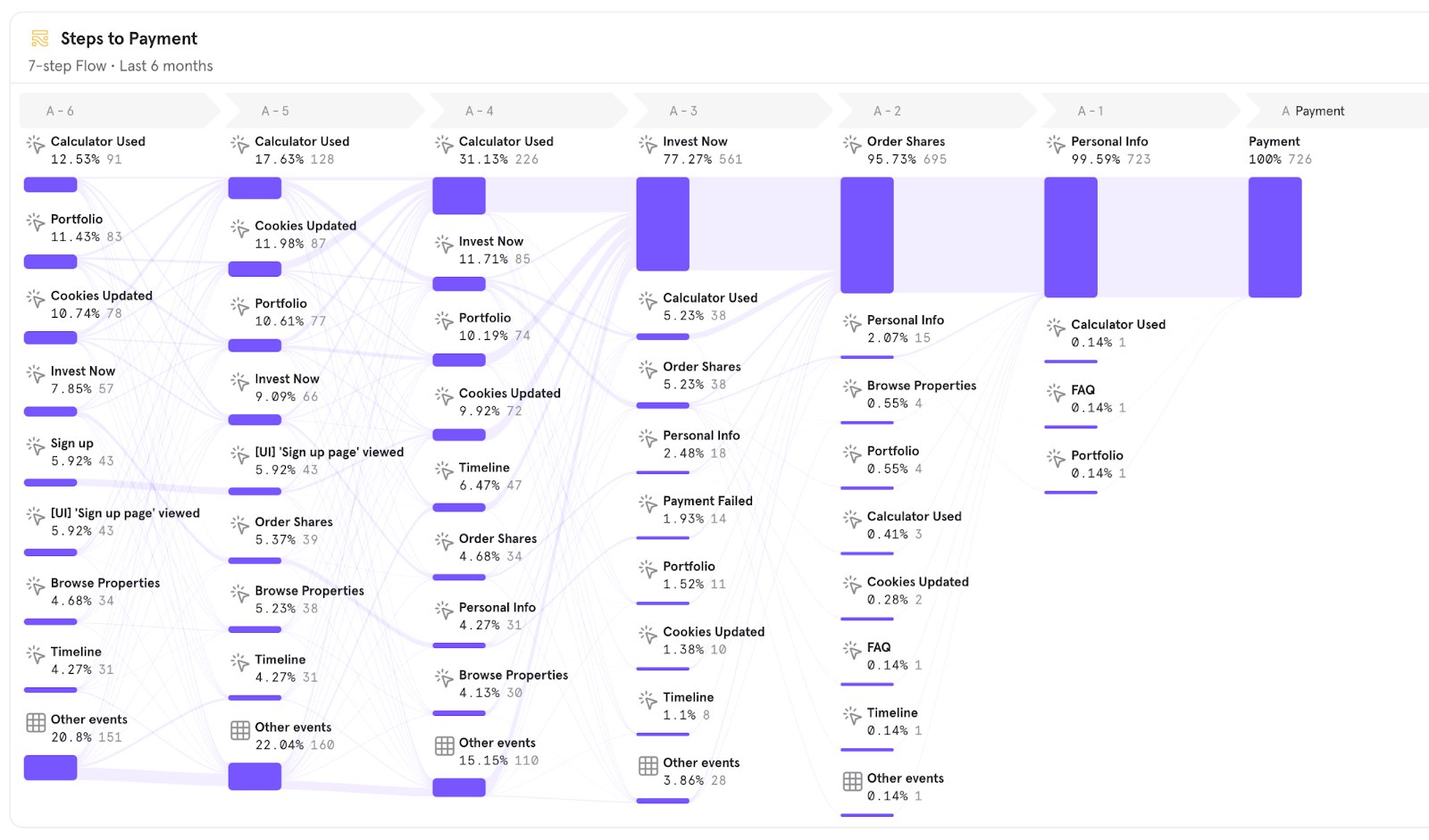
We learned more about how users navigate real estate investing from the web platform user behavior.

We dissected the optimal "browse-to-invest" experience and we tried to leverage it in creating our solution.

Investor tendencies

Our web platform analytics have shown that over half are first-time investors, around 40% are investing to diversify. Over 80% were investing in real-estate for the first time.

We found that the main user goals from using BRXS’ mobile app were to: diversify investments, generate passive income, or increase their savings returns.

Two proto-personas are deduced from the research:

  • First-timers to investing (who want less volatile investing)
  • Diversifiers (who aim to balance their other investments)

Exploration and design concept

Enabling access to investing through design

We started with building wireframes to get the rough idea and try and meet requirements. But first:

Why a mobile app?
In order to make real estate investing really accessible to everyone. Users must have access to their portfolio and to investing at all times. That includes getting the adequate news in a timely manner and get the opportunity to make their money decisions.

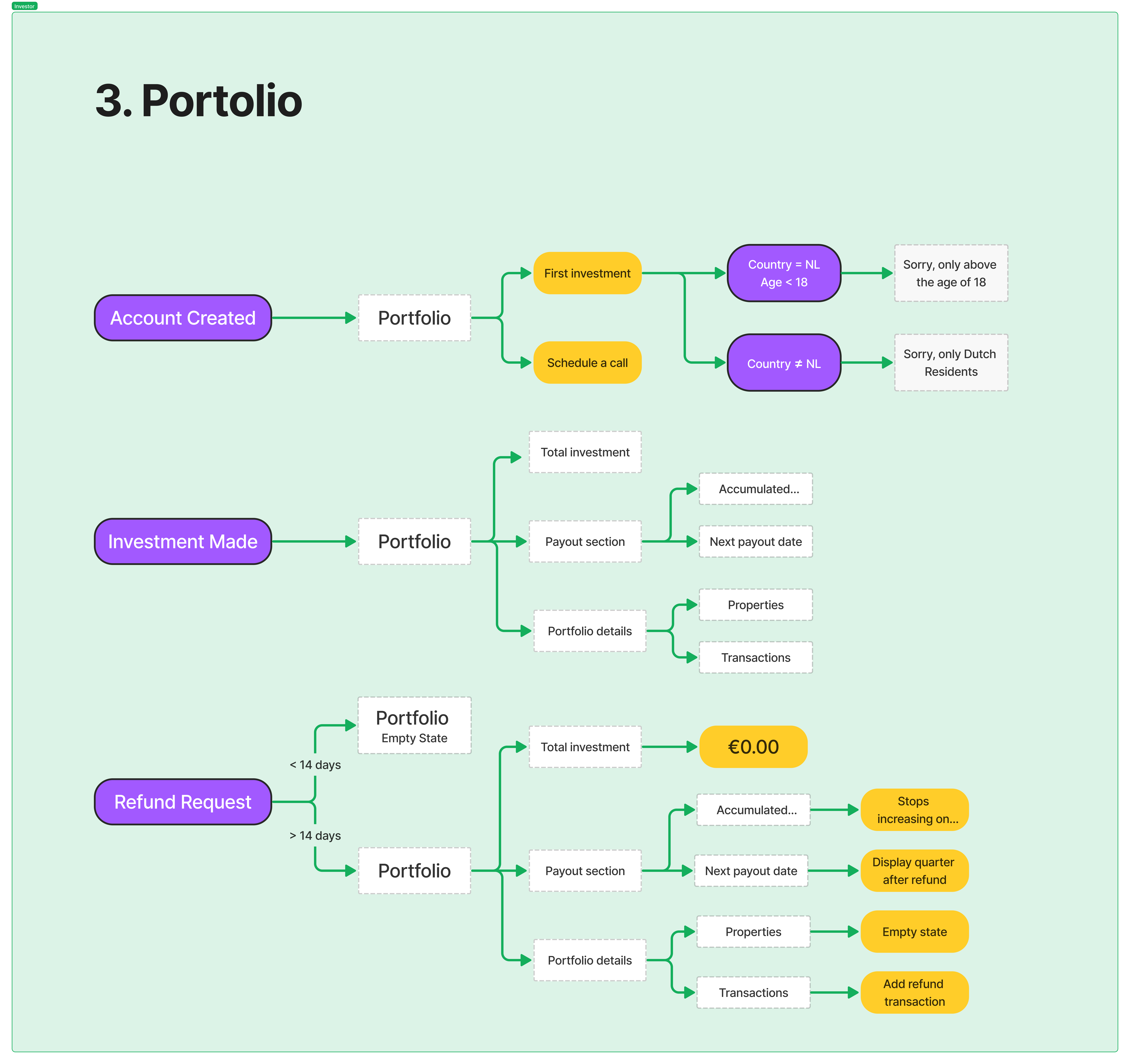
User flows & Wireframes

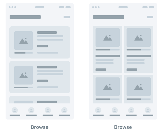
We tried a few pieces of information on the browsing experience (investment marketplace). Given that this screen is the first contact of the user to real estate, we expanded in deciding on how to display the property item in the marketplace with accessible language.

Prototype

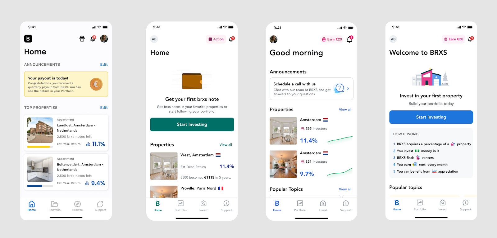
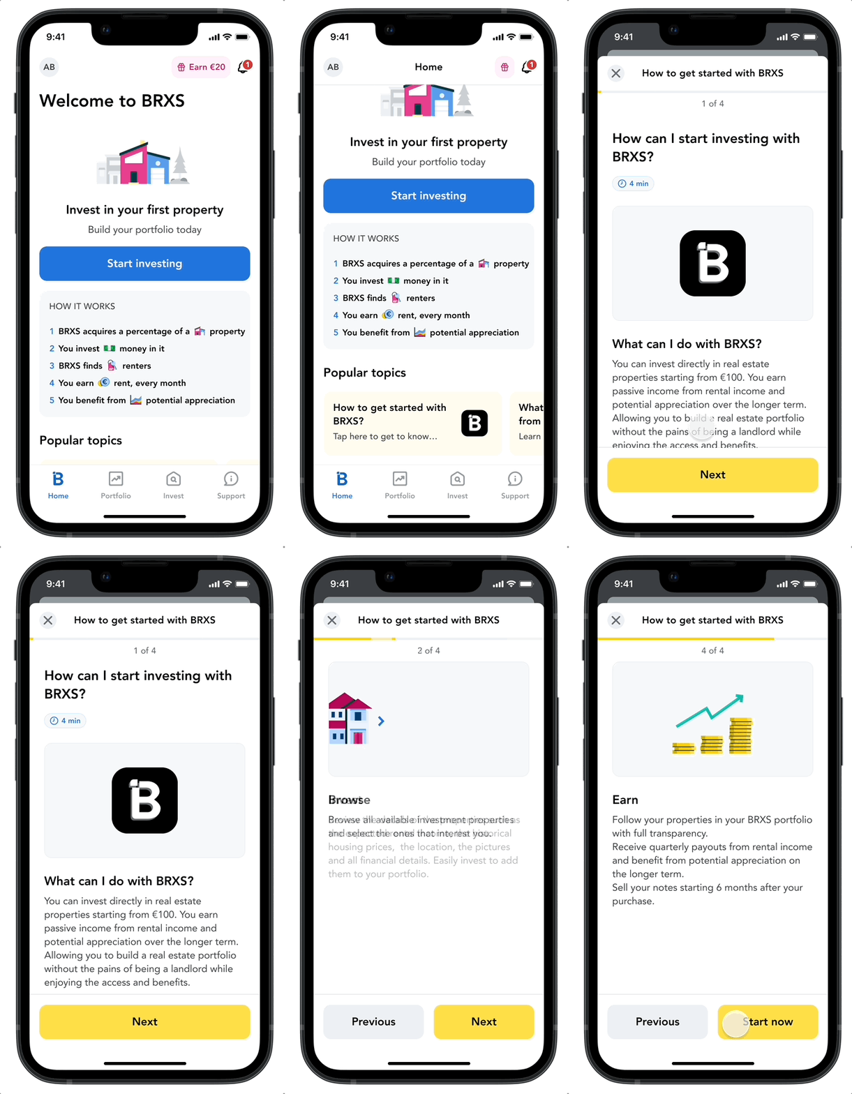
We aimed to add a navigation element where we have more scalability to the real estate investing experience. So, we added a home/summary screen. Here is how we iterated it:

Testing & Feedback

Understanding user reasoning and ways of use

We tested the BRXS mobile app with some investors as well as non-investors; the results helped us focus on what matters. We wanted to revisit our question of what problem we are solving for; so we asked the following:

- “What value, if any, did the app provide?"

"Easy investing , Notifications (e.g. new or sold-out property), Quick portfolio check, Accessible asset browsing, Personalization, Ease of use, Seeing overall income."
“There is too much education at every step”, “No personalized info”

Finding ways to make the platform relevant and educational

Transparency of numbers for less simplicity and customization

  • It was a shared belief within the company that investing should be accessible by putting education first. Providing custom calculations shows a risk of giving  - if any - unsound financial advice, due to the long-term nature of the investment, as opposed to stocks/crypto.
  • The tendency to design for transparency can seldom lead to designing for cognitive overload. We decided to focus later on finding this balance in order to  provide a timely-and-educational experience.
  • We prioritized the simple investing (i.e. impact/effort ratio was not high enough to make this the priority for the first build of the mobile app)

Absolute clarity vs. over-simplifying investing

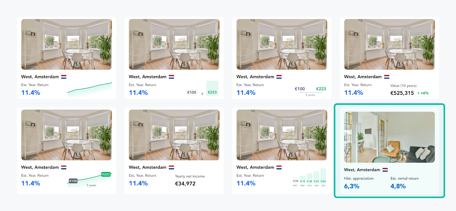
This consideration was due to the fact that educating about real estate investing included two indicators that require different inputs/factors. We wanted to provide knowledge about the notion all the while keeping the transparency of our platform. We also took interest in pinpointing which numbers are the most relevant to the browsing experience.

Why are those two numbers important?

Historical appreciation and rent are not based on the same market factors. This adds an extra level of complexity for users to start investing in real estate, therefore, we decided to include two performance indicators for each property. Our users and other market stakeholders loved this approach, even though it contradicts some heuristics.

Solution

Real estate investing at your fingertips

Let’s focus on five core elements of our solution. You can also check the app out on the AppStore, the Playstore in the Netherlands, and on Web anywhere in the world.

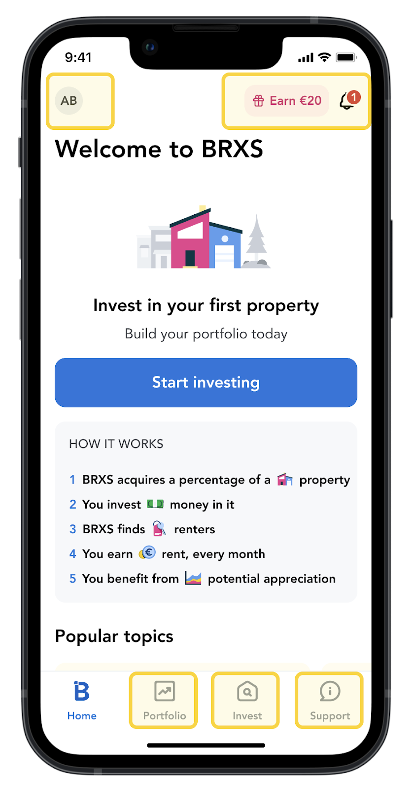
Home Screen layout: Hot corners for primary, secondary, and tertiary actions

We leveraged the simple UX heuristics to create a scalable navigation system. The main rule of thumb was that nothing is more than three taps away to ensure stickiness, as well as a low lostness rate.

Learning tips: Articles at a glance

A big problem with the current "investing apps" sphere is the lack of timely, human-centered education. We aim at creating shortened tips that are quick to navigate and consume, before starting an action.

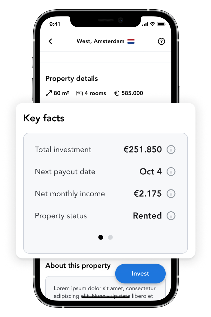
Key facts: Empowering the decision

To make the investment decision easier, we add the main points that differentiate each property. This empowers users to read through each element and put their real estate investor hat on.

An efficient investing experience

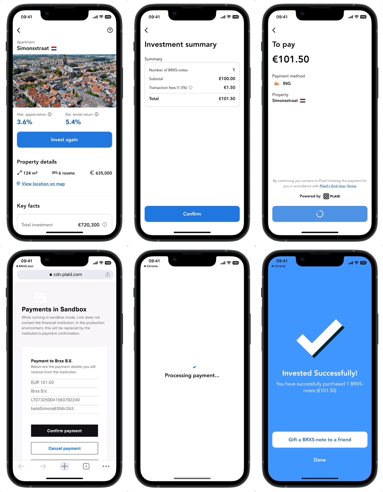
We simplified the investing experience to the least amount of disclaimers and made sure to include non-estimations. We wanted to be transparent about investing: That means no estimations, just gearing up our users with the same information the top 1% gets on their investments.

Daily accumulated returns in portfolio: A habit-forming driver

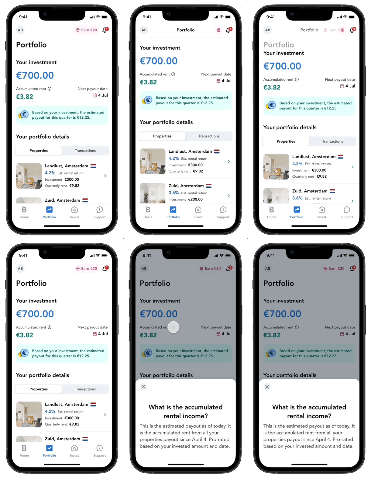
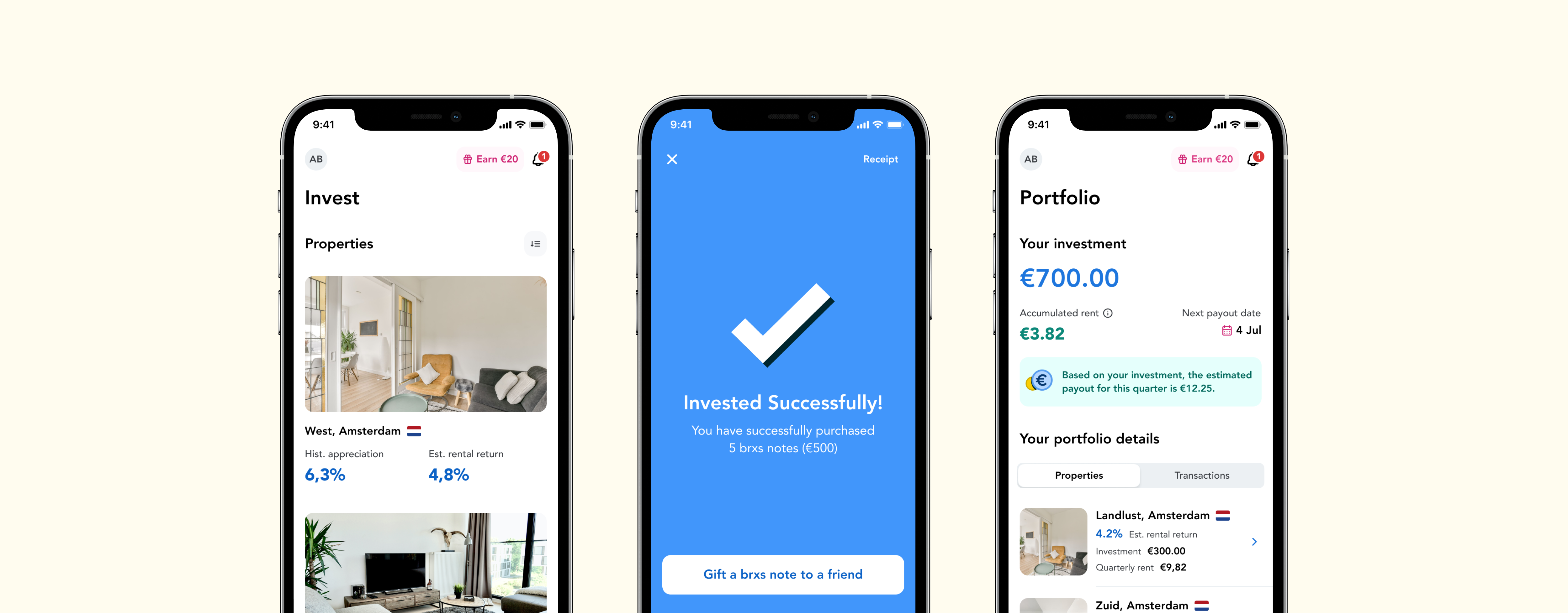
We added a daily increase of the accumulated rent so users get to see their stable rental passive income grow daily. This component aims at building a mobile-first investing experience, where users are in control of their money and can in turn take quick actions with their disposable income.

How did the BRXS app do?

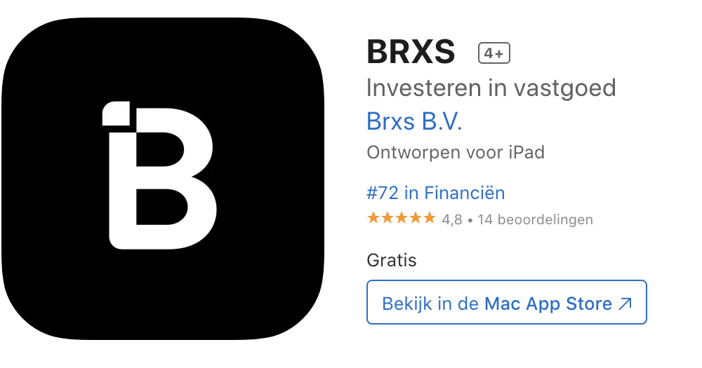
In less than one month, the app reached the #72 rank in Finance in the Netherlands.

Impact

Outcomes

7.93 NPS

Score with Easy UX, clear returns, and Good UI as the main drivers.

16.18%

Signup-to-Investor conversion making the post-onboarding experience more purposeful for real-estate first-timers

37.6%

Recurring investment conversion with a high likelihood to recommend 8.7/10

Highlights of the project

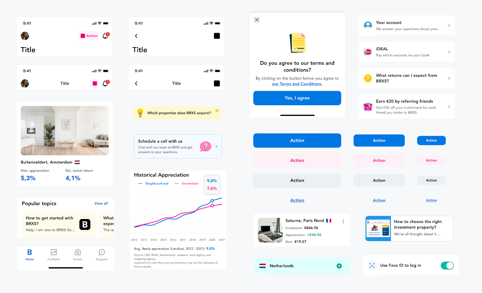
Creating the atoms, patterns, and a full multi-platform design system from scratch.

I crafted a scalable design system to be reused for future features/products. Together with the product team, we made a component logic that is based on a master component that controls the visual language and instances that control the states that are based on the user experience.

Making the Web & Tablet apps

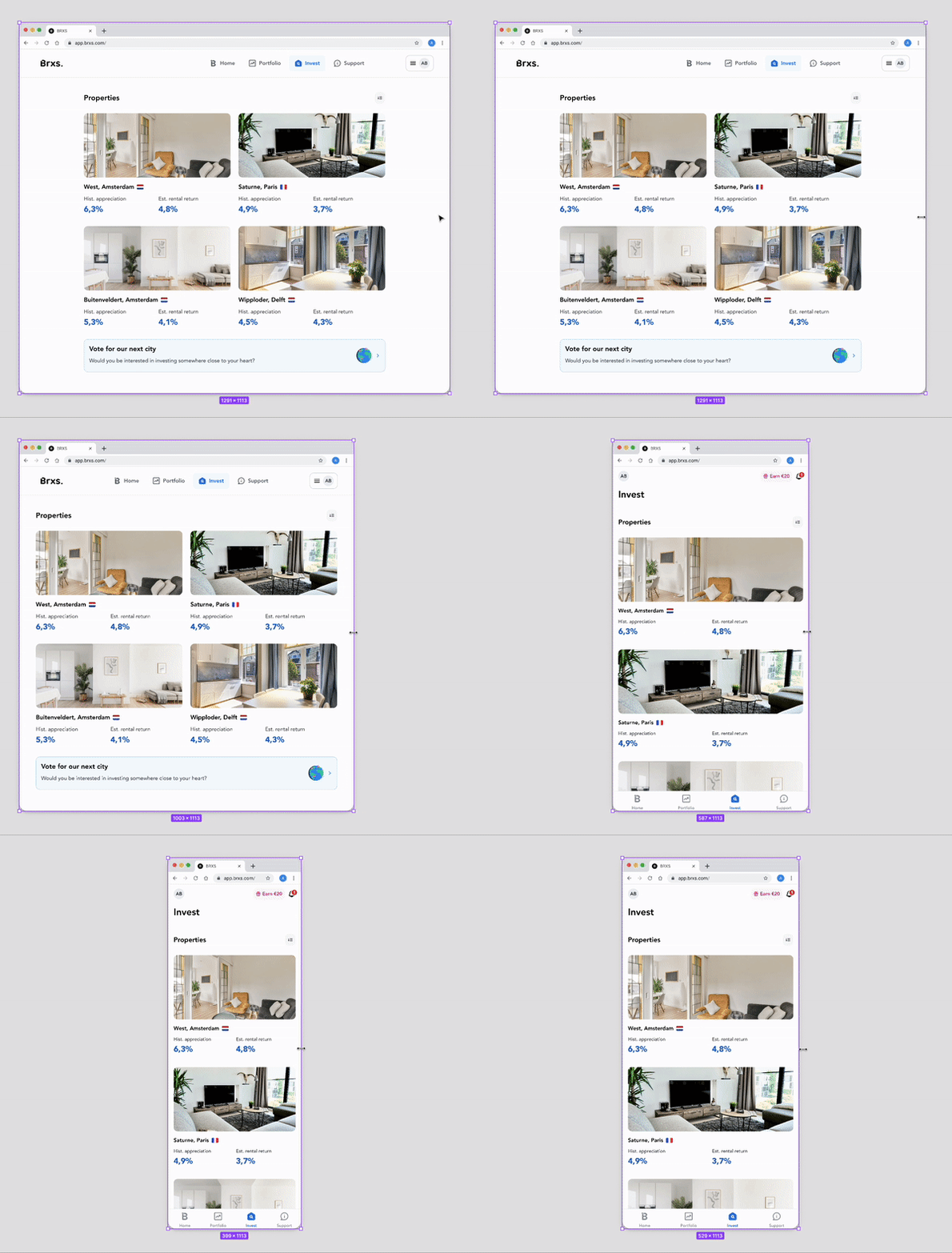
Thanks to the new design system, we made the apps for tablet and web that are consistent from a visual and experience point of view.

Learnings

What I uncovered thanks to this project

  • I designed a scalable visual system for all products and communications, with multiple variables that help everyone on the team re-use.
  • I expanded my knowledge on how much a design decision impacts business requirements and how I can quickly react with a robust plan.
  • I furthered my experience with user motivations for browsing, choosing, and buying rationales.
Summary

I led the design & creative effort to launch a real estate investing platform and contributed to getting €1M in investments in less than 1 year. I created a user interface library with all required components in order to unlock the mobile development process, allow scalable theming and consistent experience.

Background & context

Investing has been disrupted by products designed to make it accessible for people to trade/invest in assets and put their money to use.

Investing in real estate is usually reserved for the few with a large enough sum of money to buy a second or third house and put that money to work, earning rent and benefiting from the change in their property value. So BRXS launched a platform where people could invest in houses via BRXS-notes, starting from €100.

Fractionalizing this asset class to the 99% is a true challenge, not only from the “offering” stand point but also from the product standpoint.
Deliverables

  • An engaging mobile application 
  • A Design system (UI Library) that can scale to more than one feature/product
  • A revamp of the current design style of the product as well as the website

We were a team of 4 people (Tech/Backend, Mobile Developer, Product Manager, and  Product Designer). During one year, I was the founding designer in this project, working on all things design; user flows, benchmarking other experiences, meeting with other stakeholders (legal, business) to ensure the focus of the project.

Problem Statement

The current investing landscape provides a more accessible digital experience of investing in almost all asset classes, all but real estate. For real estate, contrary to trading apps, it is a struggle to get started due to the large sums needed and the low short-term return (i.e. confirmation of your investment).

How do we make real estate investing accessible? Is it just via a digital product?

Research and Insights

We aimed to design accessible real estate investing for the right users. BRXS launched a web platform where people could invest in houses via BRXS-notes, starting from €100. We gathered data from users to learn more about how we can design a digital product that empowers them to achieve their goals.

Investor tendencies

Our web platform analytics have shown that over half are first-time investors, around 40% are investing to diversify. Over 80% were investing in real-estate for the first time.

However, users had experience with other assets (Stocks 64%, Bonds 14%, Crypto 75%, ETFs 59%)

The main drivers for non-investors were the lack of knowledge, or “not having the time to do their research”.

Two proto-personas are deducted from the research:

  • First-timers to investing (who want less volatile investing)
  • Diversifiers (who aim to balance their other investments)
We found that the main user goals from using BRXS’ mobile app were to: diversify investments, generate passive income, or increase their savings returns.

We learned more about how users navigate real estate investing from the web platform user behavior.

We dissected the optimal "browse-to-invest" experience and we tried to leverage it in creating our solution.

Exploration and design concept

We started with building wireframes to get the rough idea and try and meet requirements, but first:

Why a mobile app?
In order to make real estate investing really accessible to everyone. Users must have access to their portfolio and to investing at all times. That includes getting the adequate news in a timely manner and get the opportunity to make their money decisions.

We tried a few pieces of information on the browsing experience (investment marketplace). Given that this screen is the first contact of the user to real estate, we expanded in deciding on how to display the property item in the marketplace with accessible language.

We aimed to add a navigation element where we have more scalability to the real estate investing experience. So, we added a home/summary screen. Here is how we iterated it:

Testing & Feedback

We tested the BRXS mobile app with some investors as well as non-investors; the results helped us focus on what matters. We wanted to revisit our question of what problem we are solving for; so we asked the following:

- “What value, if any, did the app provide?"

"Easy investing , Notifications (e.g. new or sold-out property), Quick portfolio check, Accessible asset browsing, Personalization, Ease of use, Seeing overall income."
“There is too much education at every step”
“No personalized info”

Finding ways to make the platform relevant and educational

Transparency of numbers for less simplicity and customization

  • It was a shared belief within the company that investing should be accessible by putting education first. Providing custom calculations shows a risk of giving  - if any - unsound financial advice, due to the long-term nature of the investment, as opposed to stocks/crypto.
  • The tendency to design for transparency can seldom lead to designing for cognitive overload. We decided to focus later on finding this balance in order to  provide a timely-and-educational experience.
  • We prioritized the simple investing (i.e. impact/effort ratio was not high enough to make this the priority for the first build of the mobile app)

Absolute clarity vs. over-simplifying investing

This consideration was to the fact that educating about real estate investing included two indicators that require different inputs/factors. We wanted to provide knowledge about the notion all the while keeping the transparency of our platform. We also took interest in pinpointing which numbers are the most relevant to the browsing experience.

The variants with multiple indicators

Why are those two numbers important?

Historical appreciation and rent are not based on the same market factors. This adds an extra level of complexity for users to start investing in real estate, therefore, we decided to include two performance indicators for each property. Our users and other market stakeholders loved this approach, even though it contradicts some heuristics.

Solution

Our solution was the whole mobile app, but let’s focus on a few interesting elements:

Home Screen layout: Hot corners for primary, secondary, and tertiary actions

We leveraged the simple UX heuristics to create a scalable navigation system. The main rule of thumb was that nothing is more than three taps away to ensure stickiness, as well as a low lostness rate.

Learning tips: Articles at a glance

A big problem with the current "investing apps" sphere is the lack of timely, human-centered education. We aim at creating shortened tips that are quick to navigate and consume, before starting an action.

Key facts: Empowering the decision

To make the investment decision easier, we add the main points that differentiate each property. This empowers users to read through each element and put their real estate investor hat on.

An efficient investing experience

We simplified the investing experience to the least amount of disclaimers and made sure to include non-estimations. We wanted to be transparent about investing: That means no estimations, just gearing up our users with the same information the top 1% gets on their investments.

Daily accumulated returns in portfolio: A habit-forming driver

We added a daily increase of the accumulated rent so users get to see their stable rental passive income grow daily. This component aims at building a mobile-first investing experience, where users are in control of their money and can in turn take quick actions with their disposable income.

Outcomes

7.93 NPS

Score with Easy UX, clear returns, and Good UI as the main drivers.

16.18%

Signup-to-Investor conversion making the post-onboarding experience more purposeful for real-estate first-timers

37.6%

Recurring investment conversion with a high likelihood to recommend 8.7/10

I created the atoms, design patterns, and a full UI library from scratch.

Learning points

  • I learned first-hand how to build a scalable design system from scratch
  • I expanded my knowledge on how much a design decision impacts business goals given how small the team and how young the company is.
  • I got more experience on how to create common ground between technical requirements, user needs, and business goals.

More projects

Creating financial inclusion for the unbanked
I designed a product as a financial inclusion instrument to the unbanked, unfamiliar population through UX.
Flouci
bunq's Universal App Search
We created a cross-app search to make the bunq experience seamless in finding features, settings, and actions.
bunq